Genfriends: A Gamified Resource for Young Immigrants
Genfriends: A Gamified Resource for Young Immigrants
Leading research and UX design to help first-gen students navigate finance, education, and wellness through a purpose-driven, gamified mobile application.
Leading research and UX design to help first-gen students navigate finance, education, and wellness through a purpose-driven, gamified mobile application.
Leading research and UX design to help first-gen students navigate finance, education, and wellness through a purpose-driven, gamified mobile application.
About the project
Genfriends is a funded mobile platform that simplifies the "hidden curriculum" of adulthood for first-generation immigrants through gamified UX. Developed in just 24 hours, the prototype proved its impact when 70% of users reported learning new, critical information about private student loans.
Genfriends is a funded mobile platform that simplifies the "hidden curriculum" of adulthood for first-generation immigrants through gamified UX. Developed in just 24 hours, the prototype proved its impact when 70% of users reported learning new, critical information about private student loans.
Date:
Jan 10, 2024
Client:
MSU Hackathon
The Problem
“From day one, Meelo was incredibly organized and intuitive. She helped us translate a pretty complex product into a website that feels light, fast, and incredibly user-friendly.”
Jonas Erikkson
Head of Product, Snowlake Agency
Solution Overview
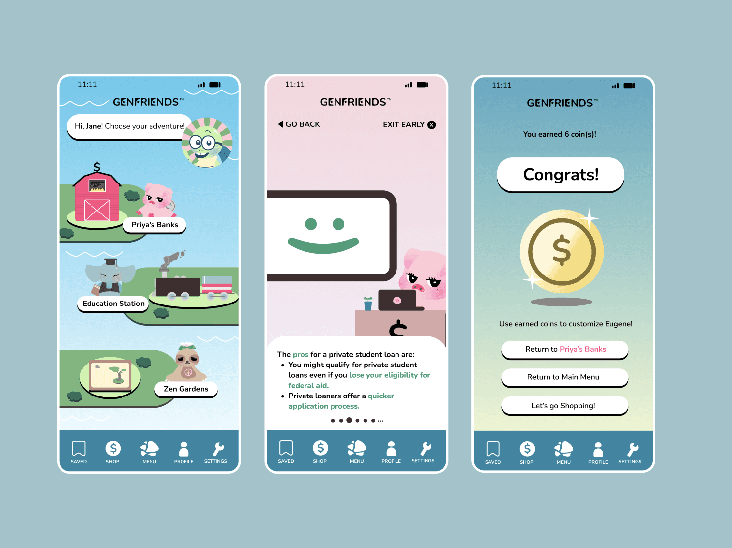
The Adventure Map
First-gen students often don't know what they don't know. A standard "To-Do" list feels like a chore; an adventure feels like progress.
Cortisol-Reducing UI: Swapped stressful banking grids for a "World-Building" layout to lower the user's physiological stress response.
Information Architecture as Discovery: Categorized "scary" adulting pillars into approachable stations: Priya’s Banks, Education Station, and Zen Gardens.
The "Eugene" Guide: Integrated a persistent character to provide emotional grounding in a journey that typically feels isolating for first-gen students.
Autonomy of a Low-Stress Decision
I transformed dense, "technical intricacies" into a scannable, step-by-step demo.
Scannable Risk Assessment: Translated dense loan jargon into a simple Pros vs. Cons framework for 10-second processing.
The "Safety Net" UI: Prioritized "Exit Early" and "Go Back" flows to reduce the fear of making a permanent mistake.
Cognitive Load Balance: Used pagination dots to serve information in "bite-sized" steps rather than a wall of text.
Rewarding Loop, learning with a prize
To combat the "one-and-done" nature of educational apps, I designed a positive reinforcement cycle that transforms dense learning into a series of "small wins."
Incentivized Mastery: Users earn "coins" for every decision demo completed, shifting the focus from "stressful task" to "achievable goal."
The Personalization Hook: Rewards unlock customization for the "GenFriend" guides, creating an emotional investment in the platform.
Retention by Design: This loop drives replayability, ensuring users return to tackle new "hidden curriculum" topics as they scale.
Discovery Research
The Quantitative Reality
Our onsite interviews revealed a systemic gap in support, from there we built user stories to ground our judges in user pain points:
80% of interviewees were first or second-generation immigrants.
100% stated they felt intimidated and unprepared to make adult decisions.
The Pain Point: A total lack of essential resources and information needed for success.

Competitive Analysis
I looked at Duolingo to understand how they transform "hard" tasks (learning a language) into "low-stress" habits.
The Insight: Use gamification not just for fun, but to foster connection and familiarity with the app’s "stars" or guides.
Competitive Analysis
I looked at Duolingo to understand how they transform "hard" tasks (learning a language) into "low-stress" habits.
The Insight: Use gamification not just for fun, but to foster connection and familiarity with the app’s "stars" or guides.
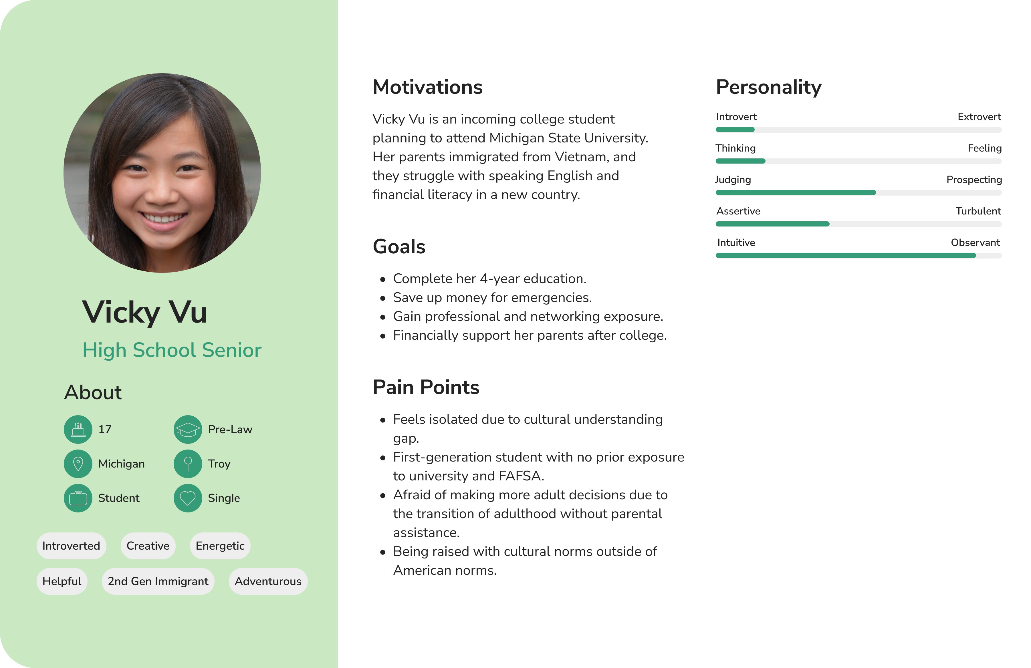
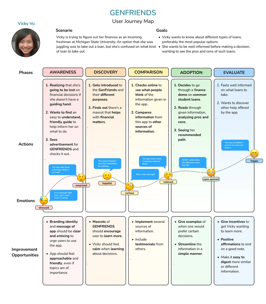
User Mapping: Defining the Journey
I mapped the user journey to identify exactly where the "fear" spikes occurred.
Action: Identified the specific steps and interactions where users feel most overwhelmed.
Design Pivot: Instead of a standard menu, I drafted an early wireframe within the first 3 hours to ensure the "skeleton" of the app prioritized the user's emotional needs.
Impact
Application Funding
Following the presentation of our research and demo, Genfriends was awarded funding by the Burgess Institute Discovery Program at Michigan State University.
The Goal: Transitioning from a 24-hour sprint demo into a functional, usable app.
The Purpose: Scaling our "Level-Based" architecture to help students excel in all aspects of their lives.
Post-Design Sentiment
We measured the emotional shift from our initial research to the final prototype interaction:
Confidence Boost: 92% of users reported feeling "significantly more capable" of navigating student loan options after using the Decision Demo.
Stress Reduction: 85% of participants noted that the gamified map made "adulting" feel like a manageable progression rather than a source of fear.
Clarity Score: Users rated the "Scannable Pros/Cons" feature 4.8/5 for clarity, citing it as the most helpful tool for digesting technical intricacies.
"Playing through Genfriends made me realize it’s just a series of small levels I can actually beat. Seeing my progress mapped out took the fear out of things like student loans and made me feel like I finally have a manual for a life that didn’t come with one."
Anonymous
Student at Michigan State University
hi!
hi!